Form Design
The Argos DataBlock Visual Designer is used to construct DataBlocks. An Argos DataBlock has two parts, the Form Design and the Report Query. The actual report layout is a child of a DataBlock, which is why reports are always listed beneath DataBlocks in the Explorer Tree. This allows you to build a single DataBlock which can serve multiple reporting needs.
If you wish to prompt your user for report parameters, the DataBlock will need to have these prompts added to the Form Design section of the DataBlock. You can also create Dashboards that display interactive graphical Dashboards and perform OLAP data analysis on your Form Design.
On this page, there is more detailed information below on the following topics:
To read a step-by-step tutorial on how to create your first form, refer to Example 1 (Building a Form) in the Argos DataBlock Designers Guide.
To read a step-by-step tutorial on how to create a Report Query, refer to Example 2 (Report Query) in the Argos DataBlock Designers Guide.
/03000012.png)
Form Design
The Form Design screen is where you build your dashboard form(s). The dashboard is the part of the DataBlock that the user sees, and contains various controls, input fields, and output displays.
The left-hand pane of this screen has three sections:
- Forms – Allows you to add multiple forms to the DataBlock. The first form listed is always launched first when a user activates the DataBlock's dashboard. Use the up and down arrows to reorder your forms or the X button to delete a form. You can rename or copy a form by right-clicking on the form name. If your DataBlock has multiple forms, you’ll need to create some way to navigate between forms such as a series of buttons (using the On-click property).
- Properties – Displays the properties of the object selected in the Design Area. These properties are discussed in more detail below.
- Variables – Lists each object created in the Design Area and allows for the creation of new variables. These variables can be SQL statements or “manual” variables. You can also copy, paste, rename or delete existing variables.
Object Toolbar

The Object Toolbar contains a collection of useful form design tools. Each object has several properties that can be used to configure the object such as height, the cursor used or the font size. Some tools have additional useful properties as noted here. Check the Object Properties section for more information on how specific properties work.
| Icon | Description | Object Area Image |
|---|---|---|
|
Selection Arrow- This tool does not create form objects, instead it is used in the typical fashion to select, move or resize objects. If you hold down the SHIFT key while using this tool, you can select multiple objects. If you click and drag, the selection tool will draw a box which can be used to select multiple objects as well. |
|
|
Delete - Use this tool to delete the selected object(s). It does not create objects. |
|
|
Undo / Redo - Use these tools to undo and redo actions. These tools do not create new objects, although Redo can be used to restore a deleted object. |
|
|
Add to Library of Objects - Add the currently-selected objects on the dashboard to the Library of Objects so they can be re-used later. |
|
|
Add objects from the Library of Objects to your dashboard. |
|
|
Label - This tool allows you to create labels on your form. Labels can contain static text, or can be dynamically filled using the Data Aware property. Labels can also be configured to use a custom cursor when moused over. You can also assign events to labels using the On-Click property. |

|
|
Shape - This tool allows you to create rectangles, squares, circles and ellipses. You can choose a rounded variation of rectangles and squares. Other features include:
|

|
|
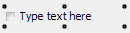
Edit Box - This tool allows you to display static text or to collect text input from a user. Edit boxes also support:
|
|
|
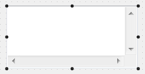
Memo - This tool allows you to display or collect multi-line input from a user (scroll bars will be added as needed). Memo Fields also support:
|
|
|
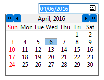
Date Edit - This tool allows you to collect date input from a user. The user can either type in a date, or click the icon to bring up a calendar. Date display format is controlled by the local PC regional settings, although the date itself is handled internally in a standard format regardless of local PC settings. Date Edit objects also support:
Click the link for more information on date handling and formatting. |
|
|
Image - This tool allows you to add images to your DataBlock. When you add an image, you have three options:
Image objects can be set to autosize (to match the exact size of the image) or you can turn that property off and enable stretch if you need to make the image larger or smaller. |
|
|
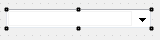
Drop-down - Create a list of options for the user in a drop-down object. The source of the choices can be manually entered, or dynamically generated from a SQL statement. Note that drop-down objects only display a single field. If your query returns more than one field, Argos will prompt you for which field to display (use a multi-column list box to display more than one column). The other SQL fields are still available for use, they just cannot be displayed. Drop-down objects also support:
|
|
|
Check Box - Create a check box to gather Boolean (Yes/No) input from users. You can define the value of the object when it is checked and when it is unchecked, and the default state. |
|
|
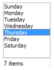
List Box - Display a single column of data and allow users to select one or more items from the list (scroll bars will be added as needed). You can enter items manually, or generate them dynamically with a SQL statement. Note that List Box objects only display a single field. If your query returns more than one field, Argos will prompt you for the field to display. The other SQL fields are still available for use, but cannot be displayed. If you need to display more than one column, use a multi-column list box instead.
|
|
|
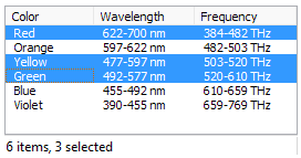
Multi-Column List Box - Works the same as a list box except that it can display multiple columns of data. It shares the same properties as the list box plus also supports:
|
|

|
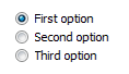
Radio Buttons- allows for the creation of a panel containing of any number of radio buttons. Radio button choices can be manually entered or dynamically generated from an SQL query. The value of the selected radio button will be stored in the variable associated with the radio button panel. For example, in the column to the right, if "Second option" is selected at runtime, "Second option" will be stored in the variable.
|
|
|
Button - Create buttons which can be used to control when other objects are run, which form is displayed, etc. The On Click property is of special importance to button objects as it is used to define what occurs when a user clicks the button. The value of the button variable is undefined until it is clicked, at which point it takes on a value of 1. This can be a useful way to control when SQL queries run as Argos will not run a query if one of its dependent variables is undefined. So by placing a line into the WHERE clause of a query like the following, you can ensure that the query will not execute until the button is depressed (replace "button" with the name of your button object):
|

|
|
Panel and Scroll box - Create an area on which other objects can be placed. Objects placed onto a panel or scroll box become children of their parent object. Both panels and scroll boxes operate in essentially the same fashion except that scroll boxes automatically create scrollbars as needed. While neither object stores text, both allow you to define a default font. Objects placed onto the panel or scroll box will "inherit" their parents’ font settings. You can, of course, override the parent font settings by setting an objects’ font directly. |
|
|
OLAP Data Cube - Create On-Line Analytical Processing (OLAP) Data Cubes. Consult the OLAP section for more information. |
|
|
Chart - Create a variety of charts such as bar graphs, pie charts, line charts, etc. When a chart is added, the Chart Wizard can be used to define the data source for the chart and other chart options. Advanced mode is available that gives complete control of all chart properties. However, once a chart has been modified in Advanced mode, you cannot revert back to the Chart Wizard. Consult the Chart Wizard section for more information. |
 Video: How to Use a Multi-Column List Box
Object Grouping
Objects can be grouped so that operations on the group such as moving or aligning can be done on the group as a whole and not on each individual object.
Objects are grouped by:
- Holding down the SHIFT key while clicking to select multiple objects.
- Click and hold down the mouse button and drag a box around objects to be grouped.
Once the objects are grouped, you can select any object in the group to move the entire group as a unit. If you de-select an object in the group the objects are no longer grouped. To permanently retain the objects in the group, select an object in the group, right-click and select the Group menu option. The Group menu option also allows you to remove the Group by selecting UnGroup or UnGroup All. UnGroup All removes all groups within the form.
When a group is selected, the set of properties common to all objects in the group is contained within the Properties tab for the group. Changing any property value will apply to all objects in the group. See the Object Properties page for a description of all object properties.
To move or adjust the properties of an individual object within a group, perform a ctrl-click on the object. You can then move the single object or change its properties and not affect the other objects in the group.
Alignment Tools

A variety of alignment tools are available to make it easy to create attractive forms. The various alignment tools are shown graphically on each button, but if you place your mouse over a button, it is described in text as well.
When a single object is selected, the only available options are to align horizontally or vertically. Note that this alignment is with respect to the selected objects’ parent. So if you align an object on a panel, it will be in relation to the panel, not the main form.
The alignment tools become more useful when you select multiple objects (hold down the SHIFT key while clicking to select multiple objects). Several new alignment options become available which allow you to align things in relation to the first object selected.
- If you need additional help creating DataBlocks, refer to the Getting Started with DataBlocks page.
- To read a step-by-step tutorial on how to create your first form, refer to Example 1 (Building a Form) in the Argos DataBlock Designers Guide.
- To read a step-by-step tutorial on how to create a Report Query, refer to Example 2 (Report Query) in the Argos DataBlock Designers Guide.